

Showing posts with label websites for writers. Show all posts
Showing posts with label websites for writers. Show all posts
Sunday, September 17, 2017
Taylorverse.com website updated and revamped!
Just a little housekeeping heads-up to let you all know that I've updated and revamped my core website, The Taylorverse, to version 6.0. Feel free to pop over and bookmark the site if you're not already a regular popper-overer.


Saturday, January 10, 2015
[Link] Your Book Landing Page—Can’t-Miss Headline Writing Secrets (and Mistakes to Avoid)
by Casey Demchak
When I was a kid there were word games where you could read a simple letter—and if you circled every fifth word you would get a secret message of some kind.
 It was neat. So neat in fact that I developed a similar strategy that works wonders on website landing pages that are designed to sell books.
The strategy is built around the fact that before anyone reads your website sales page, they will almost always skim your headlines first. If all a visitor does is skim your sales page headlines and subheads, they should receive a concise selling message and a confident call to action.
This “secret” message will often entice them to go back and read all the copy between your headlines to learn more details about your book.
Here is an example of how this headline sequence technique can look on a web sales page promoting a business book.
Continue reading: http://www.thebookdesigner.com/2014/12/your-book-landing-page-cant-miss-headline-writing-secrets-and-mistakes-to-avoid/
When I was a kid there were word games where you could read a simple letter—and if you circled every fifth word you would get a secret message of some kind.
It was neat. So neat in fact that I developed a similar strategy that works wonders on website landing pages that are designed to sell books.The strategy is built around the fact that before anyone reads your website sales page, they will almost always skim your headlines first. If all a visitor does is skim your sales page headlines and subheads, they should receive a concise selling message and a confident call to action.
This “secret” message will often entice them to go back and read all the copy between your headlines to learn more details about your book.
Here is an example of how this headline sequence technique can look on a web sales page promoting a business book.
Continue reading: http://www.thebookdesigner.com/2014/12/your-book-landing-page-cant-miss-headline-writing-secrets-and-mistakes-to-avoid/
Thursday, December 4, 2014
Basic Webpage Design for Writers

In this day and age, when even simple, fill-in-the-blank tools like Wix, Blogger, Wordpress, and Webs can create an attractive, easy-to-navigate site, there's simply no excuse for any author to have a less-than-professional looking home on the Internet.
And just a cursory glance at a few author sites this morning for both folks I know and support and folks I don't know at all tells me that we need a basic web design for authors seminar.
The top five glaring "sins" I see as I look at writers' pages?
- Unhelpful or confusing navigation, or no navigation at all.
- Overly long blocks of text with little to no white space and/or graphics.
- Annoying rainbow colors and/or blinking text to highlight key items.
- No "brand" ID or site logo.
- All content thrown together on one single page rather than broken up into more useful chunks.
NOTE: I am a designer and have designed numerous web sites both professionally and personally, but, what I'm demonstrating here is not advanced technique. These are the basic design elements that will enable your author page to be attractive, follow the eyes' natural reading disposition, and meet the needs of web readers. What I'm demonstrating here are merely the basic building blocks that you can dress up and personalize in as many ways as there are website owners to adapt them.
Essentially readable, attractive web design gets down to three basic components for the non-web designer author:
- Title/Logo
- Navigation Menu
- Content
So let's look at each of the parts and get to know them and what makes them work on an effective website.
Title/Logo
For example, the title image of this blog is designed to reflect the pulpy, genre-writing tone of the content. My friend Bobby Nash uses a logo that reinforces the notion of a writer as a computer typists and eschews images altogether.

Navigation Menu
A navigation menu can be done in many ways, across the top or down the side or as part of the title logo as an image map (if you want to fancy it up a bit). Regardless, a good navigation menu will divide the content of the site into pages that break up the monotony of a "one long page of everything' text dump. Like goes with like.
For example, the categories across in my menu here on the blog divide my content into separate pages for the blog's content, from reading the key articles and checking for in-person author appearances, but it also includes my promotional pages for reading reviews of my books and purchasing my books. Thanks to the navigation menu, readers who only want the blog content can use that, but readers who actually want to support me as an author can do so as well, without being forced to do both in one long page of digging through the stuff they don't want to get to the stuff they actually want.
And that is the purpose of an effective navigation menu, in a nutshell, to get readers and viewers to the content they are looking for in the quickest, most efficient way possible.
Content
Content is the key to a good website. Period.
Content can include text or text and images. The best content is some mix of the too, using images that related to the text on the page. Fundamentally , it should be easy to read, with no fancy text effects just as blinks or highlighted backgrounds or funky, eye-killing fonts. Images should be neither tiny nor huge, and fit easily within a single screen scroll. And, speaking of scrolling, typically a well-designed page of content (i.e., a page that is categorized in your menu navigation plan) shouldn't go on for more than 3 screen scrolls typically unless the page is a feature article or online short story.
Don't forget white space in your content. A visual break is one of your best friends on the web. That means keep your paragraphs short and your margins wide.
Getting Graphic
I know what you're thinking. Telling me is one thing, but I really want you to show me what you're talking about. Okay, since showing instead of telling is the hallmark of being a successful writer, I'll do it here too.

This image illustrates four of the most common ways these three elements are put together for basic, attractive website design. And yes, these are very generic looking, but this is the basic, 101 class, not the fancy one for web-gurus. You can always dress them up later as your skills grow.
In the top left model you get the basic blog-style stacked design with a logo on top, followed by a navigation menu, and finally the actual content.
In the top right, you get the side-navigation model, with the logo on top and the menu to the left of the content.
In the bottom left, is one of my favorite designs, which incorporates the menu into the logo image.
In the final, bottom right model, you basically have an inverse of the one above it, with the menu on the right instead of the left. Be careful with this one, because if you aren't careful you can have the menu slide off the side of the page in some browsers.
Putting Myself on the Chopping Block -- A Case Study
Let's look at a real-life example. Click this link now (a new window will open for you to flip back and forth to examine while you read): www.taylorverse.com.
That's my official writer's website (this is my official blog, in case you're confused -- okay, it's semantics).
Let's examine the title/logo. It's a little busy (and the dialog balloon even pokes fun at that), but it's clear from the logo where you are and what you're in for on the site.

Next let's look at the menu bar. At first glance it's a blog stack model, but if you look closer you'll see that the menu is actually part of the image, tabbed across the bottom, so it's a blend of the top left and bottom left design times from the image above. Getting all that on one page would be a nightmare, so these tabbed categories help readers get to what they want.
Finally, let's look at the content. All it says on the main page basically just a hello and welcome. It has a few book cover images, a drop cap (like in a book since I'm a writer), and an illustration of me to dress up the text a bit. To personalize it a little, there are a few quotes down the side.
Notice this. The page scrolls only once.
Why?
Because the page is just to let people know where they are. The menu gets them to where they want to go next. My main page is an invitation to go deeper. That's the sole point of it.
If my main page were an invitation to buy my books, then it would be a differently looking page altogether.
Here are a few examples of attractive, efficient, but not expensive and fancy, high-fallutin' author sites:
- http://christafaust.net/
- http://www.petrucha.com/
- http://www.stephenzimmer.com/
- http://www.vitodelsante.com/
- http://daadams.com/
And in Conclusion...

- Use a logo that tells readers who you are and what your site is for.
- Set up an efficient navigation menu.
- Don't dump everything on one page and make readers scroll and scroll and dig and dig.
- Keep your content engaging and arranged by categories (like goes with like).
- Think graphically and make it look good.
Of course, you can get more advanced than this with your design, but even these basics will give you an easy on the eyes, simple to navigate, efficiently laid-out site that won't scream "I don't know what I'm doing."
Sunday, March 25, 2012
[Link] Questions that authors are never asked
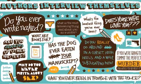
My eight-year-old son, when asked by a school friend what his mother's job was, said: "She's a typist." True, I was in my study typing some fiction or other at the time; I overheard, through my window, his judgment in the garden.
As a liberated woman, would you nevertheless prefer to have been born a man?
Both sexes experience the joys of love-making. If she chooses, woman has the additional extraordinary experience of growing a life inside herself, and presenting the world to it. It's painful - all right. But the wider experience in life a writer has, the better the ability to identify with lives other than the writer's own, and create varieties of character, states of being, other than his/her own. I sometimes think, for example, I've missed out on extending emotional experience by never having been sexually attracted to a woman. Anyway, a writer as such is a special kind of androgynous creature, all sexes and all ages when creating fictional characters, all the people he or she has known, observed or interacted with. So while I'm a woman, as a writer I'm a composite intelligence.
Why do you never write about sex?
I find it embarrassing.
More embarrassing than violence?
God, yes.
Do you ever write naked?
Not quite naked, but on hot, humid summer days (my study is poorly air-conditioned) I have to strip down to my undershorts to work. But almost stripped, there's a definite feeling of the elemental while I'm writing, a sense of physical exertion that's a welcome counterpoint to the endless operations of endless thought.
Find out who gave these answers and read more at: http://www.guardian.co.uk/books/2010/may/29/writers-hay-questions-never-asked
Saturday, February 11, 2012
[Link] Best Blogs for Writers to Read in 2012
Best Blogs for Writers to Read in 2012
by Robert Lee Brewer

As I said in last year's best blogs list, there are so many blogs out there by and for writers. The list below identifies blogs that I personally think are the best blogs for writers to read. If you don't agree with any of the selections (or think I missed a spot), then share your faves in the comments below. That way, I can check them out for next year's list.
Continue reading: http://robertleebrewer.blogspot.com/2012/02/best-blogs-for-writers-to-read-in-2012.html
by Robert Lee Brewer

As I said in last year's best blogs list, there are so many blogs out there by and for writers. The list below identifies blogs that I personally think are the best blogs for writers to read. If you don't agree with any of the selections (or think I missed a spot), then share your faves in the comments below. That way, I can check them out for next year's list.
Continue reading: http://robertleebrewer.blogspot.com/2012/02/best-blogs-for-writers-to-read-in-2012.html
Friday, February 3, 2012
The Writer Will Take Your Questions Now (#69) -- Websites for Writers
What do you recommend for a writer wanting to promote his or her work online?

1. Opt-in Site
2. Sales Letter Site
3. Authority Site with a Blog
4. Affiliate Site
5. Membership Site
Don't know about the rest of you, but I do believe a writer needs more than one presence on the web, but I wouldn't think he or she needed five. I'd suggest:
1. Online brochure type site for general info
2. An authority site with a blog (to establish a name in a specialty)
3. A social media site for interaction with fans (separate from personal social media site if you want to keep that one closed to actual friends and family)
4. A store page that links to your books on the web, whether you set it up yourself or simply point readers (and buyers) to the listings at Smashwords, B&N, Amazon, Indy Planet, etc.
I think that's a good plan for an online presence if you want to promote yourself.
I agree that one static site isn't good enough anymore because it doesn't allow interaction, and even if it does have a message board, sorry, all the people are at Facebook. But having only a Facebook page doesn't give you a place to build your portfolio showcase or easily point to sales outlets (without having to do it all the time and have them get buried on your page day after day).
The one some people might not see as a full necessity at this point is the blog that sets you up as an authority on a specialty. But I think this one (yes, this little ol' blog right here) is going to prove more helpful than I would have suspected early on, as people start to see "Sean Taylor" as "that guy with the really cool pulp and writing articles who sure seems to know his stuff." And a good blog keeps you on your toes with regular content to share with your current fans and clients and builds a backlog for your future fans and clients to discover. Just be sure not to use it solely to post your press releases. Use it to give back to your audience and reach new readers.
Subscribe to:
Posts (Atom)