

But what about modern books? What makes a cover effective for them?
As one reader, Tina Osborne, mentioned on my Facebook page when I posed this question: "An attractive cover gets me to look at the cover. An effective cover gets me to open the book."
That's not a bad description, but what does it mean?
So we went to the publishers, artists, and writers to find out.
What's the difference between an attractive cover and an effective cover?
Pete Miller: A reader can think a cover is attractive even if they have no intention of buying the book. I could see a beautiful painting of a horse and rider and think it was gorgeous, but would have no intention of buying it. An effective cover is also attractive but also says to me, "Buy this book." Of course every buyer is different and no cover is effective to all buyers.
M.D. Jackson: An attractive cover catches your eye, sure, but it doesn't tell you one thing about what you will find underneath it. An attractive cover may get people looking but if the story that it covers delivers something else the reader will feel cheated. You can't just slap art on a book and call it a cover. The Mona Lisa is great art but it's not a cover image. You can put a Frank Frazetta cover on any book (and Ace did just that for a long while) and it will give your sales a boost for that one book, but if the book doesn't deliver then no one will remember anything except the cover.
An effective cover is a cover that gives the reader the "feeling" for the story they're about to read. Hopefully it catches their eye but it must also tell the reader more or less what they're gonna get and at the same time get them jazzed about it. An effective cover depicts something about the story that it covers in an exciting, intriguing and, above all, an honest way.
Matt Hiebert: Not sure there is a difference. But I guess an effective cover could be unattractive (The early Mack Bolan books) Is the price on one is lower?
Danielle Proctor Piper: I'd say attractive covers feature exceptional art or really great subject matter...but an effective one will have something about it that resonates with me personally. With any luck, the effective cover will feature something currently popular that entices potential readers to learn more about what's going on inside the book.
So far as design goes, I myself find a "broken", disjointed design as exciting as a simple cover featuring say just a logo, a good character drawing, or a full edge to edge illustration. If I like a specific artist's work and see his or style on covers, I may well by those issues just to see more of that artist's work.
James Ritchey III: Nobody gets paid for ugly. 'Eye-catching' is simply not drawing, painting, etc. bad. If a design is bad, people will look at it and know something they can't put their finger on is wrong wid it. I prefer good ideas for covers, but I dunno if they're any more or less successful in drawing an audience. All is hubris.

Aaron Meade: An attractive cover will grab your eyes and gravitate you towards the book which in turn makes you OPEN the book, and hopefully you have an artist which can pull the load once you've opened it. Now, an effective cover is more condensed in its content, i.e. The Watchmen with its black cover with a smiley face with blood. In my opinion, an effective cover might get overlooked by the fanbase that loves good artwork even though it is a good marketing ploy.
Sarah White: I think the key is composition. A picture can be pretty, but if it isn't framed and balanced right for the cover, it'll look a little off. But even a cover with less than perfect artwork but with a really clever composition will be much more effective.
Lee Houston Jr.: An attractive cover will do what it was designed to, get the readers' attention. But that at best will just get them curious about the book. An effective cover will not just attract the readers, but indicate what the book is about without actually giving the plot away and present a book that MUST be read. I was blessed to have David Russell on Hugh Monn, Private Detective and think lightning has been caught in a bottle again with Mark Guerra on the impending release of Project: Alpha.
Ron Fortier: An attractive cover is nice to look at. An effective cover makes someone have to buy the book to find out what the imagery is about. They need to know the story behind that image. Covers should be both all the time.
Barry Reese: An attractive cover is simply that -- something that's nice to look at. To me, an effective cover is one that makes you curious enough about what's inside to want to read it. They're not always the same thing -- but the best covers are.
Van Allen Plexico: An attractive cover doesn't necessarily have to tell you anything about what's inside the book in order to be effective. I've bought a ton of books in my life--especially when I was younger and less discriminating-- based purely on how cool the cover art was. Sometimes I enjoyed the book and sometimes I didn't, but that would've been the case either way.
Stephen Zimmer: Attractive and effective are the difference between a good artist doing a cover and a good artist who is also skilled in layout and design. An effective cover reflects good layout, and almost by default will also be attractive.
How importance is a consistent design and typeface for the covers in a book series?

M.D. Jackson: Consistent design and typeface is as important to a series of books as a logo is to a product. It gives the reader an instant identification that tells them that this is the next book in a beloved series. It can be graphically simple as with the Twilight covers (a risk because the simpler it is the easier it is to emulate, as several book series did trying to cash in on the Twilight brand chachet) or it can be a consistent cover artist, like Don Dos Santos with the Mercy Thompson Novels, or, more famously, James Bama's Doc Savage paperback covers.
Matt Hiebert: Very, until a later separate printing.
James Ritchey III: Keep it consistent -- AT LEAST match serif or sans-serif each to its like.
Krystal Rollins: Book series (even tho I am not a big fan of these) should be consistent.
Aaron Meade: I believe that it is VERY important to be consistant with logos and typeface on a series simply because the reader associates these with their favorite books. I could go into a comic book shop and with a quick scan of the room identify the Avengers logo from a mile away. IF you change it too often the reader may feel fustrated in looking for the book that theyve become accoustom to.
Sarah White: Extremely important. It creates a sense of continuity and unity over a series. A change in the typeface is like a change in the story. It really shakes people up.
Lee Houston Jr.: I think it is very important. Once you establish a look and a logo for a series, you don't go changing either unless you have absolutely no other choice in the matter. That way, over time, the reader has an idea of what to look for when searching for the next book in any series.

Barry Reese: An attractive cover is simply that -- something that's nice to look at. To me, an effective cover is one that makes you curious enough about what's inside to want to read it. They're not always the same thing -- but the best covers are.
Stephen Zimmer: Consistent typeface and design for a series are almost imperative in my view. I think Matt Perry has done a wonderful job giving the Rising Dawn Saga and The Fires in Eden Series their own unique styles and consistency, in my case.
How are comic book and book covers different in their goals and purposes? How are they similar?
Pete Miller: Since comics are typically (especially these days) a single chapter, they need to convey to the reader the conflict of the chapter. Books need to sell the whole concept and will often feature the hero with an iconic bit of scenery from the story to tell the reader something about the whole world.
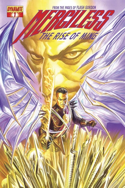
M.D. Jackson: Comic book covers have the same mission to perform with their covers, but as they are trying to do that every month they have to be punchier, and edgier. Usually bright (BRIGHT!) colours are the order of the day. There's no quarter in being subtle when you're trying to move so many issues off the racks. The typography of comic book covers is even more important in this regard. The type styles are usually wild and almost garish with a definite "brand" or "logo" quality. And you want your figures on the covers -- the more muscular and sexier the better. A landscape isn't gonna sell Issue 176 of your series, but a knock down, drag out will.
Matt Hiebert: They are two different mediums. With comic books, art is probably why they are purchased, so the cover must reflect that at some level. With books, you're representing an idea or "feeling." Even a solid black cover might appeal to your audience.
James Ritchey III: The standard for comics logos and whatnot are generally thicker-outline -- or HAVE outlines. Dunno if that's a standard to shatter or not. With BOOKS, KISS principle. Spare me from 'bubble-wrap' lettering though -- horrible mistake I made in early uses of Photoshop typesetting for logos -- it must be easy to-read, rule one..
Krystal Rollins: Comic books are powerful with lots of color and illustration. More illustration is used to tell the book rather than words. A regular book needs less illustration as it uses more words.
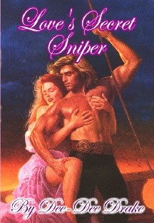
Now on a regular hardback or softcover book, i.e. Harlequin romances for example, you do usually get a great painting or drawing or photo on the book, but seldom do the covers of these book act as an extension of the story within, most times on the romance novels you need to read the story synopsis on the back of the book to know for sure what the book is about. They are mostly gimmicky and there to hold the book together.Not all books are done in this niche BUT a majority are.
Sarah White: I think a comic book cover is more abrupt. It's trying to get people to pick it up impulsively, based on a pretty picture or an exciting pose or a clever subtitle. A book cover is a longer consideration, it feels like. And people are more likely to pick up a novel with a bad cover than a comic book with a bad cover, because a novel with a bad cover could still potentially be a good novel, but people assume that with a comic, the interior is going to be like the exterior. So if the cover art isn't great, they're going to automatically assume that so is the interior art.
Lee Houston Jr.: Each must have a cover that will make readers interested in a specific periodical, with the ultimate goal of making the reader want to read it. But what the book cover artist does every so often, the comic book cover artist does month after month.
Barry Reese: A good cover for each is attractive and effective (see question # 1). But these days more and more comic books have pin-up covers that are generic and tell you nothing about what's inside. I prefer ones that in some way reflect what you're getting in the interior. Then again, many pulp covers were pin-up style, as well, and could have been used interchangeably for each other. Some people will tell you that New Pulp books shouldn't look too "comic booky" or whatever, but I say that an attractive, effective cover is just that, regardless of whether or not it's drawn or painted or whatever.
How do you choose between using an illustrated cover versus using a photo cover? What about covers that don't have images at all and use typeface and design only?

Covers with just type can also be effective statements, and eye catching - especially in thumbnail size on internet retailers.
M.D. Jackson: As far as a cover that has no illustration at all, those usually don't interest me. Book covers are trending that way -- minimal (or sometimes no) cover art, photographs, or just simple graphics. Case in point a recent edition of A Game of Thrones which sported a gold gradient behind a minimalist graphic of a griffin. It was a huge bestselling fantasy novel with virtually no cover art at all.
Naturally I like cover art, partly because it's what I respond to but also because it is what I do. No cover art means no cover artist which means unemployment for me or someone like me. So naturally I prefer the cover art to be just that: art or illustration.
Danielle Procter Piper: Typeface is more exciting to me if it's varied, but it's been drummed into me for years that it's too difficult to read...with comics and graphic novels, typefaces can actually add to anticipation by creating drama on their own.

James Ritchey III: Depends on the genre. A mystery, thriller or mainstream or 'soft' SF seems like it can be pretty minimal -- just letters--while romance, horror (albeit DARK), adventure/fantasy and hard SF needs pretty pictures. Go to a used bookstore, and just keep looking -- don't even buy anything. Figure out the type of cover you like.
Krystal Rollins: A photo cover tell of one thing and sometimes that is really important and focuses the reader on that one person.
Aaron Meade: My opinion may be bias but i believe in COMIC BOOKS you should use artwork to sell the book. Period. Every once in a while you will see a photo used in background and that WITH artwork is ok from time to time BUT I personally NEVER go for a comic with a photo only or typeface. There might be a GREAT story inside but i will never know it because the cover didn't grab my attention enough for me to open the book. Again i.e. reference the Watchmen books. I loved the story but never knew of it till AFTER the movie came out. Because the cover lacked the pull of great artwork.
Sarah White: I would never use a photo manipulation cover. I think they look lazy and tacky, and I have never seen it done well. As far as just typeface covers, I think they should be used sparingly. One every once in a while stands out from the crowd, but I think something with just a typeface cover should have either a very distinctive title or a very distinctive typeface. But if you don't have a picture, you have to get the mood of the book across in just the title logo.
 Ron Fortier: We had never used a photo cover before until the release of our newest title, which has both a painted portion against a photo background. I would personally never use just a photo cover, as genre fiction is about drama and imagination, not reality. As for books with no pictures on the cover , I don't buy them. They have no appeal to me what-so-ever. And thus you'll never seen any of books without a gorgeous painted cover. Period.
Barry Reese: I generally prefer illustrated covers but a skilled artist/designer can make me love anything. For some types of books, I think photo covers work better than on others, but there are exceptions to every rule.
Van Allen Plexico: It seems to me you see far more text-only covers on hardcover books, which (ironically) are usually larger and would have more room for art than paperbacks do. Why do you suppose that is? I've always wondered.
=======================================================================
For more information: Pete Miller -- M.D. Jackson -- Matt Hiebert -- James Ritchey III -- Krystal Rollins -- Aaron Meade -- Sarah White -- Danielle Proctor Piper -- Van Allen Plexico -- Barry Reese -- Ron Fortier -- Stephen Zimmer
"Plaster board walls don't cut it. Effective cover is an engine block, a half inch of steel, or at least six inches of concrete. Also, it's good to be wearing some body armor when the bullets start flying." Sly Gantlet, The Nuclear Suitcase & The Gantlet Brothers Greatest Hits
ReplyDeleteLove it!
ReplyDelete